Sunday 31 January 2016

Wanderlust Book: January

Every two weeks, we get a prompt on Wanderlust to inspire us to create a journal page for our Wanderlust Book. I'm using my old WOIW journal, which is a small, wirebound book with simple kraft paper inside. There's still plenty of space left in it to accommodate all my Wanderlust pages this year.

The January prompts were: 1) one word that describes me today and 2) what I really want is...

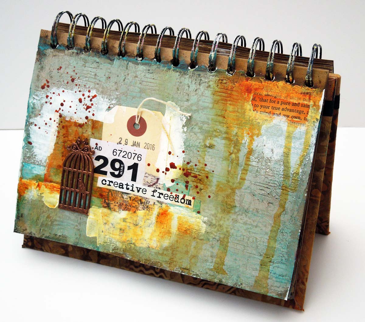
As you will see, my two pages are quite different from each other. One is my usual colourful/happy/simple style, while the other is a more muted/grungy/"experimental" style, heavily influenced by Donna Downey and somewhat by Kasia as well, at Everything Art.

I was feeling hopeful when I created the first page back in early January: hopeful for the New Year and specifically because I was hoping to hear positive news about a job interview I had attended. Since then I had learned that I didn't get the job, but hey-ho, I'm still feeling hopeful! It has occurred to me that without having art to fall back on, the rejection would have been a lot more painful. Now I'm thinking, at least I have more time to create art and I intend to take full advantage of it as well!


My second page expresses a yearning to achieve creative freedom. Freedom from my own fears, inhibitions, lack of self-confidence, lack of ambition, etc. I also want my creative time to be guilt-free, so I can enjoy it without having to seek permission or approval from my environment, specifically my husband, who's not always entirely supportive of my artistic endeavours.



Saturday 30 January 2016

LifeBook Week05: A Vessel Full of Tenderness

A Vessel Full of Tenderness is the title of the lesson for Week05 of LifeBook by Pauline Agnew. I didn't think I would enjoy this lesson as much as I did, because I wouldn't normally paint flowers in a vase, though I like to feature whimsy flowers in my art. I'm not sure I did this lesson "right" as it looks nothing like what we were supposed to paint but I sure had fun with the process! I realize it's very busy and perhaps not so easy on the eyes, so proceed at your own risk.

I added the raffle ticket and some stamping on the background for a more "mixed-media" feel. Underneath all that paint there's an old map, but I'm afraid I managed to completely obliterate it with all this paint on top.

I'm happy with my efforts, but's it's becoming increasingly evident that I'm never going to be a "great" painter, nor am I aiming to be. I just like playing with textures and colours!


Thursday 28 January 2016

Let's Play: Using left-over paint

I'm a bit late linking up with Carolyn Dube's Let's Play party this week, but better late than never! The January theme of using something that you would have thrown away continues. On this spread, I only used left-over paints from my pallette, which was a piece of deli paper. I first smudged the wet paint on my pages, then I collaged the deli pieces on top, once they were dry. I could never get this sort of random, distressed look on purpose otherwise!

Last week I worked on a page and I couldn't be bothered to find a piece of deli, so I just squirted my paints on a non-stick craft sheet. I really regretted doing this because all those yummy paints dried on my sheet and went to waste. I had no choice but scrub them away and wash them down the sink. This is not only bad for the environment, but it was also a lost opportunity for me to transfer all that colour into my artwork. So never again! I will always, always, always use a separate piece of paper for my palette from now on. Deli paper works best but it can be any other paper suitable for collaging.

Here's the page I created with my left-over paints. I simply stencilled some white flowers on the background and roughly outlined them. This was a very quick project and made me happy! My Play Journal is now almost full!


If you would like to join Carolyn's link party just  click the image below!

Let's Play!

Wednesday 27 January 2016

WOYWW #347: Playing with alcohol inks

Another Wednesday have come around (much too soon if you ask me), which can only mean one thing: WOYWW! Luckily, I remembered to snap this shot of my desk last night.


Oreo was keeping me company, watching me work on one of my LifeBook lessons and for once he didn't spill my water all over the table! That's my Play Journal in the foreground, which I used to smoosh the leftover paint on. I will be posting the completed page later this week.

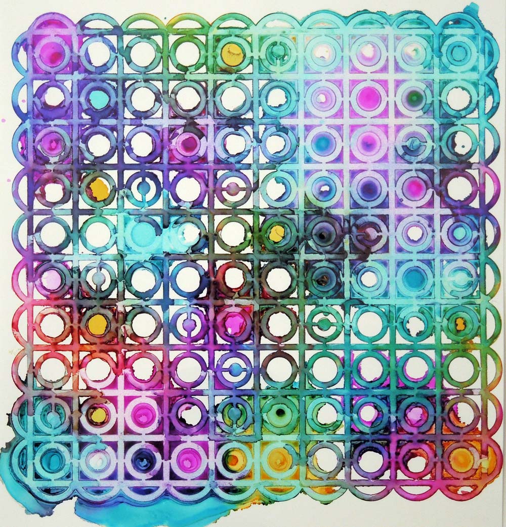
Today, however, I'd like to share the results of my play session with alcohol inks. This is a technique that involves using alcohol inks with stencils on Yupo paper. It's very easy and doesn't require any artistic skills, as the inks tend to do their own thing. I used Ranger's Adirondack alcohol inks, the Nature Walk collection. I've tried to make my own using Brushos, but it didn't work.

The photo below shows the stencil in place on top of Yupo paper, which is a kind of smooth, synthetic paper made of plastic. You just drip the ink on top and allow it to seep under the stencil. You can facilitate the flow of the inks with some additional clear alcohol. (Ranger makes their own blending solution, but I'm pretty sure it's just plain alcohol.) This is what it looks like with the stencil in place:


It's best to wait until the alcohol has completely evaporated before removing the stencil, otherwise the inks might run into each other and obliterate the stencil patterns. Although in some cases that may be the look you're after! Here are some of my results on Yupo paper:


Be warned though, your stencils will be permanently stained with the alcohol inks. You can clean them with pure alcohol, but they will never be pristine white again. However, you can use the ink stained stencils to your advantage! I placed them on top of deli paper and reactivated the inks with alcohol. This produced something similar to a ghost print:  


I can use these pieces as collage material in my journals. Once the alcohol has evaporated, these inks are permanent. This is a definite plus for me, as I was getting increasingly frustrated with water-based spray inks, which lift as soon as you put any wet media on top of them. Alcohol inks, however, stay firmly in place! 

Thanks for visiting today! I hope you've found my post about alcohol inks informative and inspirational! 

Tuesday 26 January 2016

LifeBook Week04: Fearless painting

Week 04 of LifeBook was presented by Annie Hamman and her 3.5 year old daughter, Tallulah. Yes, you read that right! Annie allowed her young daughter to "mess up" her painting repeatedly and incorporated some of her marks in the process. This lesson was meant to help us become "fearless" artists, giving up control, allowing our inner child to emerge and influence how we do art.

This process was an uphill struggle for me. I must have painted 20+ layers, though you probably wouldn't tell looking at my painting now because I covered up too much with subsequent layers. I well and truly let my inner child loose on this project, but my controlling adult self kept "correcting" and "controlling" the painting, so my art is not so fearless as I was hoping. I was getting quite frustrated by the end so I stopped at one point. I think I will come back to this lesson later in the year and have another go. Until then, I will keep Tallulah's motto in mind: "You get what you get and you don't get upset".


Monday 25 January 2016

LifeBook Week03: 47 years of Wisdom

This was a lovely LifeBook lesson by Melody Ross titled 'Your Sacred Box of Wisdom'. Her colourful, whimsical art is well within my comfort zone and very close to my own "style" if I have one at all. I've joined her Brave Girls Club, which sends me daily inspirational emails. Check it out, it's free!

Fast approaching my 47th birthday (did I really say that out loud?), this lesson came just in time for me to reflect on all the wisdom I've gathered so far. When I sat down to write down my thoughts I was surprised how easily they flowed out of me - quicker than I could type, in fact! If only I had known some of these things when I was younger - life could have been much easier!

I followed Melody's sketch for the composition, but I mostly added my own textures and colours to it. I quite like how the (almost) primary colour scheme works on my page. It wasn't something I had planned - it just happened this way. The box is painted gold, which shimmers in certain light conditions, along with the stickles added to the butterflies. I've tried to show this in one of the photos. I've also used book papers, raffle tickets, napkins and washi tape as collage pieces for added interest, and there's also some stamping in the background. I chose numbers for the raffle tickets that are significant to me.

I loved this lesson and it's one of those pages that will remain close to my heart in years to come!


The gold paint and stickles shimmer in the light.