Friday 27 February 2015

WOIW: Beautiful

The word of inspiration this week over at the Kraafters Kommunity on Google Plus is BEAUTIFUL. I came across this quote "be your own kind of beautiful" and thought it would fit my page quite well.

I started out by collaging bits of a napkin on my page, then added blue and green gelatos (cotton candy and lime green) which I blended with gesso. Next, I applied a layer of white acrylics paint with a brayer to tone the colours down a bit further. On top of this layer I added a few drops of Golden's fluid acrylics in Quinacradone Nickel Azo Gold. This colour achieved the type of rusty look that I love so much.  Here are some photos of my process so far:

Collaged napkins

Gelatos added

White acrylics applied with a brayer

Golden's Quinacridone Cickel Azo Gold added
Next, I glued down a butterfly and the word 'papillon' cut from another napkin. To balance out the composition I decided to add another butterfly before stamping my quote with archival ink. As a finishing touch, I shaded my elements with a black Stabilo ALL watersoluble pencil and used a black Gelato to create a shaded border around the page. I also splattered some black ink all over the page.

First butterfly added


Wednesday 25 February 2015

WOYWW 299: Last week's projects and happy mail

We're closing in on the 300th What's On Your Workdesk Wednesday rapidly now. One more week to go! I hope to make it next week, it would be a shame to miss it! Such a round number only comes about every two years, which tells me WOYWW must have been running for at least 6 years, though I only joined earlier this year. Anyone is welcome to join in this fun blog hop, just head over to Julia Dunnit's Stamping Ground to find out the details!

I expect you guys want to see my messy desk first. This is what it looked like on Monday afternoon. I was working on my latest LifeBook project, while munching on a piece of banana cake. I had to blur out a tag in that tray on the right, because it is part of a tag swap I'm taking part in and I don't want to ruin the surprise. Since my last post, I bought another few bottles of Golden fluid acrylics while they were on offer and I made that orange box to store them in. The problem is, there's room for another six bottles! I like things to line up neatly, don't you?  Though I try not to be too specific about it, LOL. Here's the pic of my desk:


And here's another pic of my work space on Tuesday afternoon with all of last week's projects laid out, including the one I was working on the previous day. You can find all these projects under the LifeBook/DLP/WOIW tabs in my menu bar. (I'm too lazy to include links to each like I normally do plus I can feel a headache developing - hopefully, its just a mild one that will pass quickly).


Also on my desk is a surprise delivery: happy mail! It came just as I was staging my stuff for this shot. Talk about perfect timing! All the way from Canada! I couldn't imagine who it was from. I completely forgot about the RAK I won a few weeks ago from our very own WOYWW-er Nikki C.  Thank you Nikki, I love all the items you sent me, especially your cute card! Here's a closer look:


That's it folks! Thanks so much for visiting! I'll do my rounds a bit later today as I've got somewhere to go this morning. Remember that job interview I had two weeks ago? Well, it looks like I got that job - well, actually there was no specific job to get - I just went there for a chat to see if  I had anything to offer that they might need. And looks like they will take me on, temporarily at least, but with prospects of going permanent. It's nothing glamorous, just picking and packing online orders but here's the sweetener: it's with Jackson's Art Supplies! They have a warehouse in a business park not far from where I live. I will be surrounded by art supplies all day long!  I couldn't ask for anything better than that, really!  I'm sure I can get a discount as well, or at least get my hands on the best deals. I'll have to be careful not to spend my entire pay cheque though, LOL!

My only concern is that now I won't have enough time to create and blog, but I know many of you also work full time and still manage somehow and I find that encouraging. Wish me luck!
Tuesday 24 February 2015

LifeBook Week 09: Jar of Favourites

This week's LifeBook lesson is taught by Lynn Whipple and features a picture of a jar of our favourite things. I changed the project a little bit - instead of the light background I opted for a dark colour and I used rubber stamps to fill the jar, which were not part of the original lesson. I also used Dylusion inks instead of watercolour paints, which resulted in a more vibrant background.

I started out by sketching a large jar shape on my 9 x 12 inch watercolour paper. I used a brush to apply some inks in four colours: sunshine yellow, bubblegum pink, tangarine dream and pomegranate. I sprayed some water on this to allow the colours to blend. When it was dry, I sealed the inks with clear gesso before proceeding.


Next, I painted the negative space with Liquitex Basics Indigo Acrylics. I thought a dark colour would look more dramatic against the vibrant inks than a light background. Also, because of the spraying, I ended up with tiny splatters of ink, which a light shade of acrylics would have picked up and smeared.  I chose this dark blue instead of black to make it look a bit less "stark".


Inside the jar I added a mixture of rubber stamping, doodles and lettering with black and white pens. These are the things that are close to my heart and I enjoy the most. I pretty much tailored the list according to what stamps I had available, LOL! Seriously though, I had the stamps because I like those things in the first place and I was glad that finally I got to use them! After I filled up my jar, I added some light shading (halo) around it with white oil pastels. I also drew a white border and applied some splatters and drippage with white ink. Here's the final look with some close-ups to follow. I hope you like my colourful Big Jar of Favourite Things!


Sunday 22 February 2015

DLP Week08: Worth Repeating

This week's assignment for the Documented Life Project is repeating elements with the journal prompt "worth repeating". I was thinking of how we all like circles and dots and decided to build my page around these fun shapes.

I started out by using two shades of turquoise paint, Golden's teal and cobalt turquoise, the latter being a bit darker than the teal. On top of this I added stenciling with two different sized punchinella stencils using phtalo turquoise and dioxazine purple. I cut circles from a coordinating gelli print and arranged them in a circle as well, and then I added some dotted washi tape. This is what my page looked like after these steps.

Initial layer - teal and cobalt turquoise
Steciling, Gelli prints and washi tape added
I completed the page with some white doodling of circles and dots and a printed title. I first attempted to hand write my title, but it just did not work. I so envy people with neat handwriting! After the shading of the elements, this is what my completed page looks like:


Saturday 21 February 2015

WOIW: Beloved

This is my journal page inspired by the word 'beloved' for  the Kraafters Kommunity challenge on Google+ Word of Inspiration Wednesday.

I chose a quote by Soren Kierkegaard, a Danish philosopher, which I could really identify with:

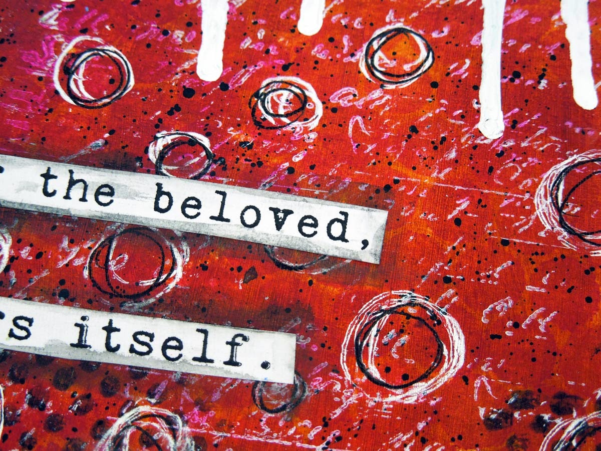
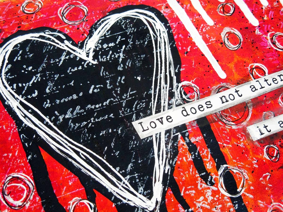
"Love does not alter the beloved, it alters itself"

This is what unconditional love is all about. Loving somebody for who they are and not try to change them to fit our perceived ideals. Or at least that's my interpretation of this quote.

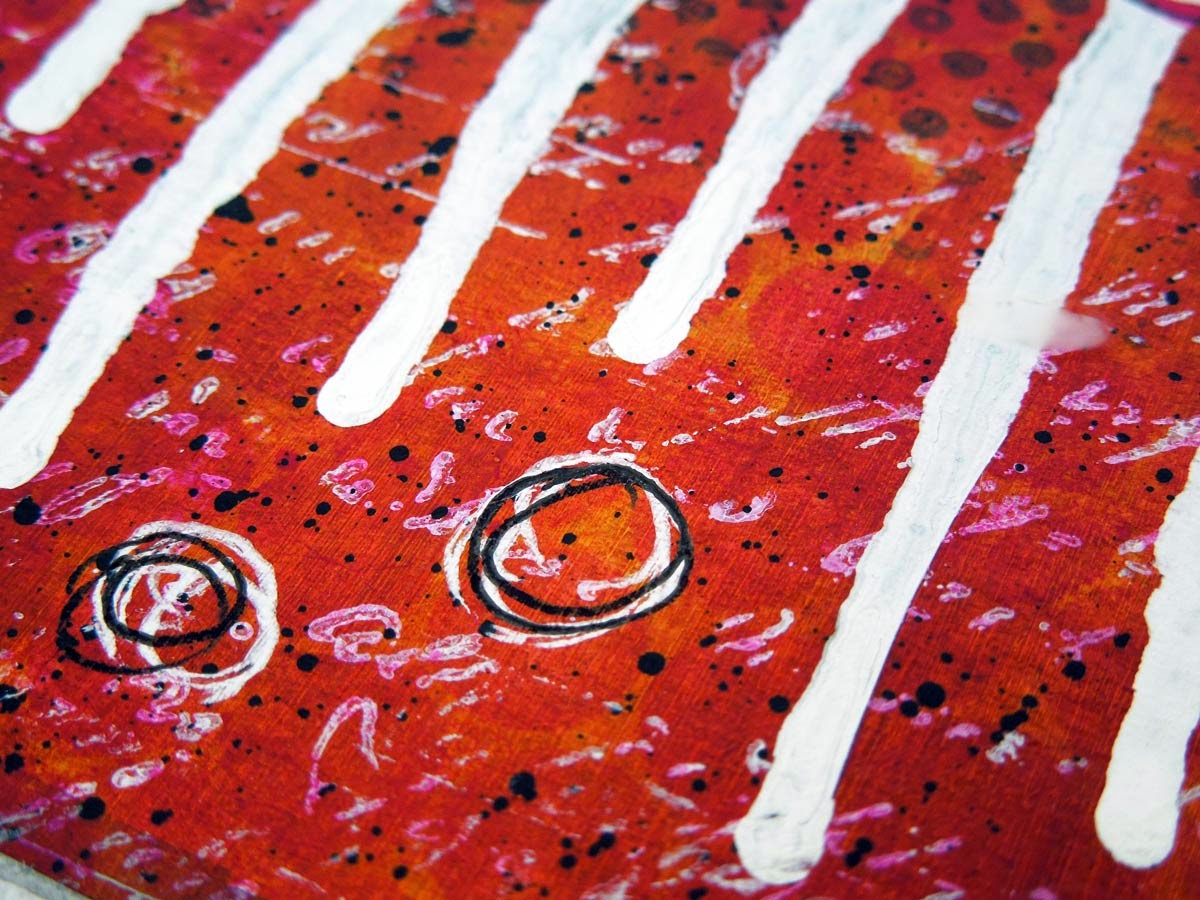
I used quite a few layers for this page, starting out with a layer of gesso. Then came a layer of Golden's Quinacridone Nickel Azo Gold and Transparent Red Iron Dioxide. Just look at those tones, wow! No wonder they're so expensive! I only needed a few drops to cover the whole page, though. 


Next, I added some Liquitex Basics Quinacridone Magenta through a punchinella stencil, followed by some stamp marks in black and white and a heart painted with Speedball's permanent black ink.


I completed the page with some white ink and pen marks and some strips for the quote.


You can see a few close-ups below showing the textures better:


Friday 20 February 2015

LifeBook Bonus: Tree of Life

Tamara Laporte released a free bonus lesson this week originally part of LifeBook 2014. This lesson is accessible to everyone who registers on her Ning site. You can find it here.

It took me quite a while to complete this project and I almost abandoned it several times. In the end I decided to keep it as it is part of my artistic journey. There are a few things I don't like about it, but also a few things that I like. On the negative side, I got the tree wrong - it looks more like an arch or some sort of gateway. I actually named it Stargate instead of Tree of Life. I have to practice drawing the eyes a bit more and work on facial symmetry, but I do like how her nose and lips turned out. I also like the colours, so in the end I decided to keep it. I don't have the time or the patience to recreate is, but the main thing is that we learn from our mistakes and just carry on. I actually enjoyed working on this piece and that's what really counts!

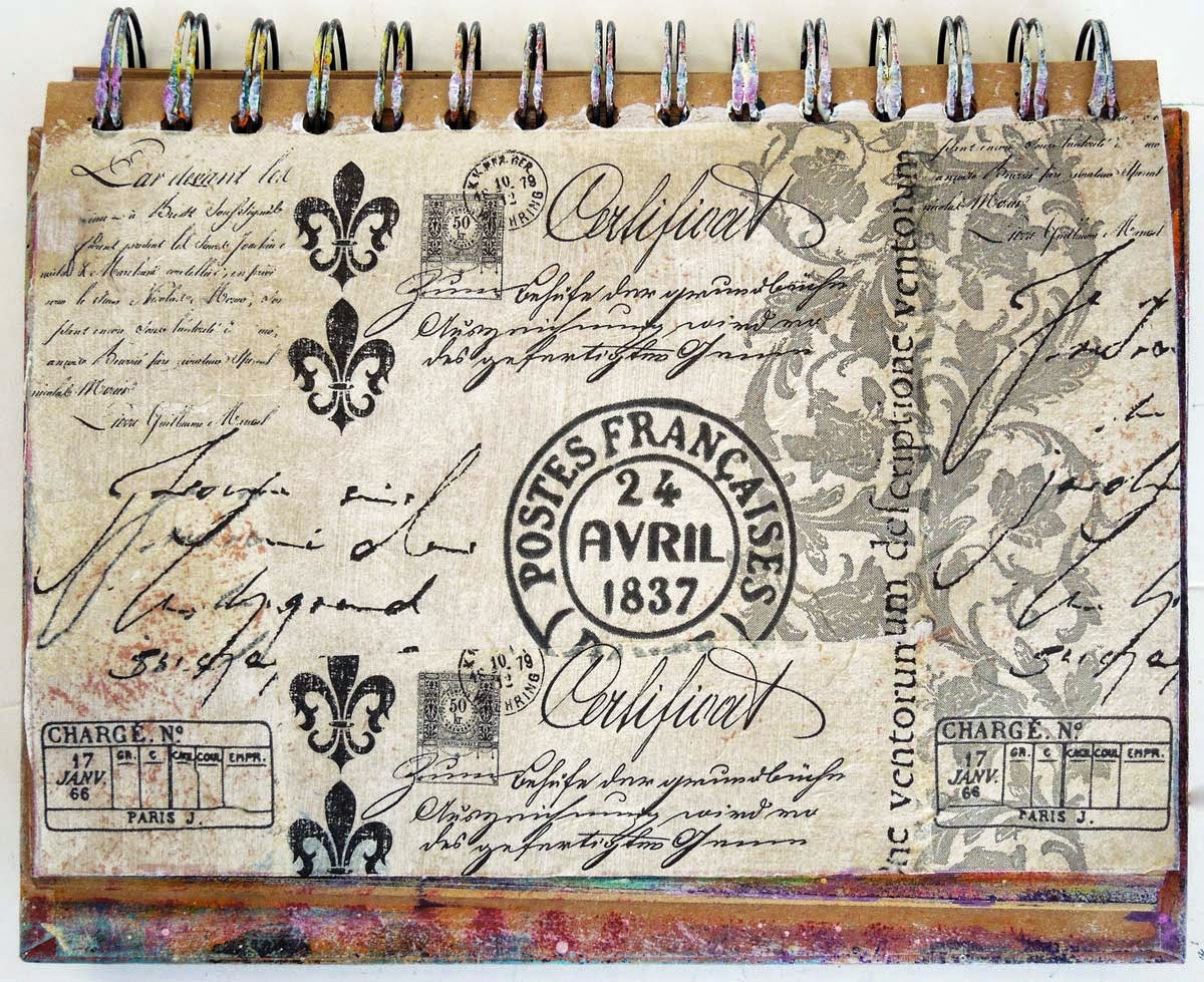
I followed Tam's process almost to the letter, so I won't bore you with the details. She's got a great time lapse video on her site if you want to check out the link above. I'll just show you my photos below: