Showing posts with label flowers. Show all posts

Wednesday, 10 January 2018

WOYWW #449: A journal page, a tag and some tattered flowers

I was really sad to take the Christmas tree down this year. I don't usually feel that way but this year was special in our new house - we really enjoyed our first Christmas here. Taking down the tree also coincided with finishing my puzzle (more about that later) which also filled me with a sense of closure of the Christmas period. It's gone now and only the happy memories remain.

I didn't have much time to feel sentimental though as on Monday, I found out that I was offered a job at the local Range to work in the Arts and Crafts department! Yay me, I'm very excited! It's a part-time job, which allows me to continue with home education until my son gets into school (September the latest) and hopefully still spend some time in my art room and blogging. We'll see how it goes - I'm very optimistic about it at the moment.

Onto my desk now quickly, as that's what WOYWW is all about! Here's a photo I took earlier this week. At the front is a nearly finished journal spread featuring my first ever tattered flower - some more are in the process of being made in the background. There's also a tag I used for leftover paint and eagle-eyed viewers can also spot a texture stamp with a brick wall pattern - I ordered it from Aliexpress (thanks Annie and Shaz for putting me onto it!) - it's really good quality and cost me the grand total of £1.17!


Here's a closer look at my journal spread with the tattered flower that was cut from Khadi paper and tinted with distress oxides. 


This is how the flower was produced and assembled: 

My next batch if flowers were cut from brown wrapping paper. I love how the distress oxides behave on that surface! I've made some smaller ones as well with the thinlits die set and put a mini epoxy flower in the middle.


I used one of the small flowers on this tag that I put together (quite haphazardly) from scraps:


And finally here's my completed puzzle! I really enjoyed working on it, though sometimes I wondered whether I will ever be able to finish it! Frustratingly, the last piece didn't quite fit, so I had to find where I went wrong, but I was able to figure it out. Some pieces were almost identical in shape and colour, so it was easy to mix them up! I'm looking for a way to preserve the puzzle - too much work has gone into it for it to just go to waste! 


Thanks for visiting today. I won't have much time to go around until later in the day, but I promise to always get back to everyone who leaves a comment! Have a wonderful day! xx

Sunday, 29 January 2017

Wanderlust week03: Journalling with Flowers

I'm running late with my Wanderlust lessons as I spent so much time trying to get my LB portraits right. Luckily, this week we only have prompts and challenges, so I have time to catch up. Last week Wilna Furstenberg showed us three ways to create floral journal spreads. I deviated from the lesson a little bit in that I used stencils and acrylic paint to make my flowers, but I adopted the idea of journaling extensively with a white pen on a darker background.

My journalling is deliberately illegible - only I know what's in there. I think I first saw this type of journalling done by Effy Wild - it has the advantage of not having to worry about your handwriting being pretty and also you can make a very personal piece public this way. This journalling is only meant for the present moment, though - years from now I won't remember what it says, but that's ok.


Happy Sunday!

Saturday, 27 August 2016

LifeBook week #34: Whimsy Flowers with Roben-Marie

I haven't been able to create much in the past two weeks due to holidays and other family commitments, and this fun LB lesson from last week by Roben-Marie Smith was just what I needed to put me back on track. I'm a big fan of Roben-Marie's loose style - scribbles and all! I thoroughly enjoyed the process and had a great time creating this page for my LifeBook.

It includes collage pieces from my gelli prints and book pages, lots of gesso, some fluid acrylics and Stabilo All watercolour pencils for scribbles and outlines. I wrote my journalling on tissue paper and attached it with matte medium. Halfway through the process, it looked rather messy and non-descript, but it all fell together when I toned down the background and added some colour and outlines. I also added a piece of altered ribbon to the top of the vase, which was a leftover piece from another project, matching my colour scheme. Working on this page made me so happy!


Thanks for visiting!
Have a whimsical weekend!

Sunday, 7 August 2016

LifeBook Week 32: Grow Free

This week on LifeBook Tam gave us the task to paint some flowers with a lot of freedom and abandonment, leaving our limiting beliefs behind. I did the bonus lesson first, which was originally part of LB2014. I actually did two versions of this assignment. They're very similar to each other as I used the same colours and finger paint technique. One of them will go in my LifeBook and the other possibly on the wall if I can find a frame for it. It was fun working on these and they took less then 10 minutes each to create. See if you can spot any difference between the two versions. I think the first one looks "tighter", a bit more controlled than the second. I'm not sure which one I like more.


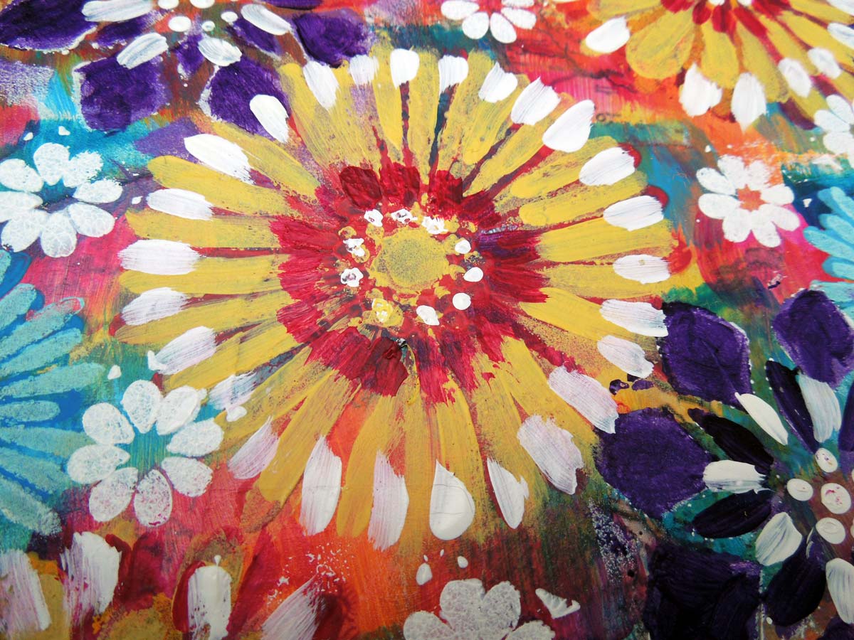
I had a bit more trouble with the main page and almost scrapped it at one point. I didn't have the acrylic spray paints that Tam used, so I substituted them with fluid acrylics. I couldn't quite get the background right, so in the end - after several layers - I just settled for a uniform quin gold. I swirled various colours of heavy body acrylic paint into titanium white to make my flowers and then let it dry overnight. I can't say I love the end result, but I'll share it anyway.


Thanks for popping in today! 
Have a happy Sunday!


Friday, 26 February 2016

LifeBook Week09: 5-minute watercolour flowers

This week on LifeBook we had a bonus lesson by Martha Lever, who showed how to paint quick and easy watercolour flowers in a pot. It was much easier than I anticipated! Part of the charm is that we let the watercolours do their thing and later when they are dry roughly outline the shapes for more definition. You can't really do this wrong!

These are my first tries, and although I wanted to do a few more cards, I got distracted by other projects, so these will have to do for now. I'm not sure how I will include them in my LifeBook, but I'll find a way. Instead of a stitched border, I just quickly outlined the edges. It takes too long to set up my sewing machine and these days I seem to have the patience of a two-year-old. It's only because I'm so excited by other projects! I still feel like a kid in a candy store who wants to try all the sweets and I keep running from one jar to the other! So much about my words for this year: balance, focus, direction, LOL!

Here are my three cards. They are about 4" X 5" in size. Happy Friday!


NOTE:  thank you all who have left comments on this blogpost. Due to a Google error, they were not published, but I did get the notifications. Hopefully, this glitch will sort itself out soon!


Saturday, 30 January 2016

LifeBook Week05: A Vessel Full of Tenderness

A Vessel Full of Tenderness is the title of the lesson for Week05 of LifeBook by Pauline Agnew. I didn't think I would enjoy this lesson as much as I did, because I wouldn't normally paint flowers in a vase, though I like to feature whimsy flowers in my art. I'm not sure I did this lesson "right" as it looks nothing like what we were supposed to paint but I sure had fun with the process! I realize it's very busy and perhaps not so easy on the eyes, so proceed at your own risk.

I added the raffle ticket and some stamping on the background for a more "mixed-media" feel. Underneath all that paint there's an old map, but I'm afraid I managed to completely obliterate it with all this paint on top.

I'm happy with my efforts, but's it's becoming increasingly evident that I'm never going to be a "great" painter, nor am I aiming to be. I just like playing with textures and colours!


Monday, 21 July 2014

Orange flower on blue background (and a lesson in Creative Freedom!)

This orange and blue design was never meant to be a piece of art, especially not one to share on the internet. I was just fooling around with my gelli plate one day, trying to print with die-cut shapes on rough, handmade watercolour paper. I wanted to see how the acrylic paint would transfer onto the rough surface. I used the ugliest brown paint I had, just so I wouldn't waste my "pretty" colours. The results were uninspiring and I tossed the piece of  paper on the scrapheap. I only just found it the other day and I started wondering what this paper would look like with my Winsor & Newton watercolours.

So I sat out in the garden and just started painting over the unsightly brown print without giving it much thought. There wasn't any pressure to create anything spectacular - after all, this was just a piece of scrap paper and I was only experimenting. There was nothing to risk, nothing to ruin. It is amazing how much creative freedom this belief gave me. I have two expensive journals (a Moleskine and a Strathmore) that I'm too afraid to use in case I ruin them.  But when I work with "scrap" all my inhibitions disappear and I feel so liberated. For that reason, I decided that I will be working on single sheets for a while, until I gain more artistic confidence to start a journal.

In this particular piece I'm sharing with you, I used cadmium red and cadmium yellow for the flower, which coordinated with the brown print already on the paper, and ultramarine blue tinged with viridian green and burnt sienna. I chose burnt sienna because the brown acrylics from the earlier print already "contaminated" my background and I thought another brownish colour would counterbalance it. To my surprise, it came out looking really good, sort of rusty in places, and so burnt sienna has become my new best friend!

I completed the layout with white outlines and doodling on the flower and white dots for a border. I also used Ranger Liquid Pearls for some dotted accents. I really like this design because it will always remind me that I can have as much creative freedom as I allow myself. Instead of trying to create a stunning page in my journal, I will just experiment with scrap pieces of paper (or fabric, or whatever medium) and have fun along the way.

I used a piece of Khadi handmade paper

I accented the outlines of the brown print with a white gel pen

I used a white gel pen for doodling and liquid pearls for accents

I love how the burnt sienna randomly mixed with the blue gave the background a rusty look.