Friday 25 July 2014

Derwent Watersoluble Metallic Pencils X 12

I've just bought a box of 12 Derwent metallic pencils. I couldn't find much information about these on the Internet, so I thought I'd write a review. These exact same pencils are also available in packs of 6, one pack containing the traditional metallic range (silver, pewter, gold, antique gold, copper and bronze) and the other the coloured ones (yellow, red, purple, pink, green and blue).

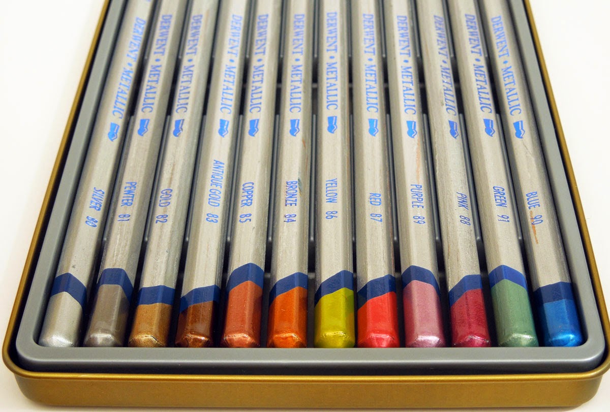
If you check the ratings on the traditional range on Amazon, you'll see that they are very poor and I understand why. First of all, these pencils are not really metallic. They may come in 'metallic' colours, but they lack the sheen of true metallic pencils. Secondly, four of the colours (gold, antique gold, copper and bronze) are virtually identical. Some of these pencils are also quite hard and it takes considerable effort to transfer them onto the paper, and once water is applied there's not much pigment left behind.

The saving grace for the larger set are the six coloured variants, though these are not very metallic either (if at all, to be honest). However, they are strongly pigmented and dissolve well with water, retaining the vivid hues. Compared to the other six pencils, they are almost like a completely different product. Indeed, they more than a little remind me of Derwent's Inktense pencils. Another thing I like about the 12-set Derwent metallic pencils is the tin. It looks really nice and shiny and definitely has the wow factor for me.

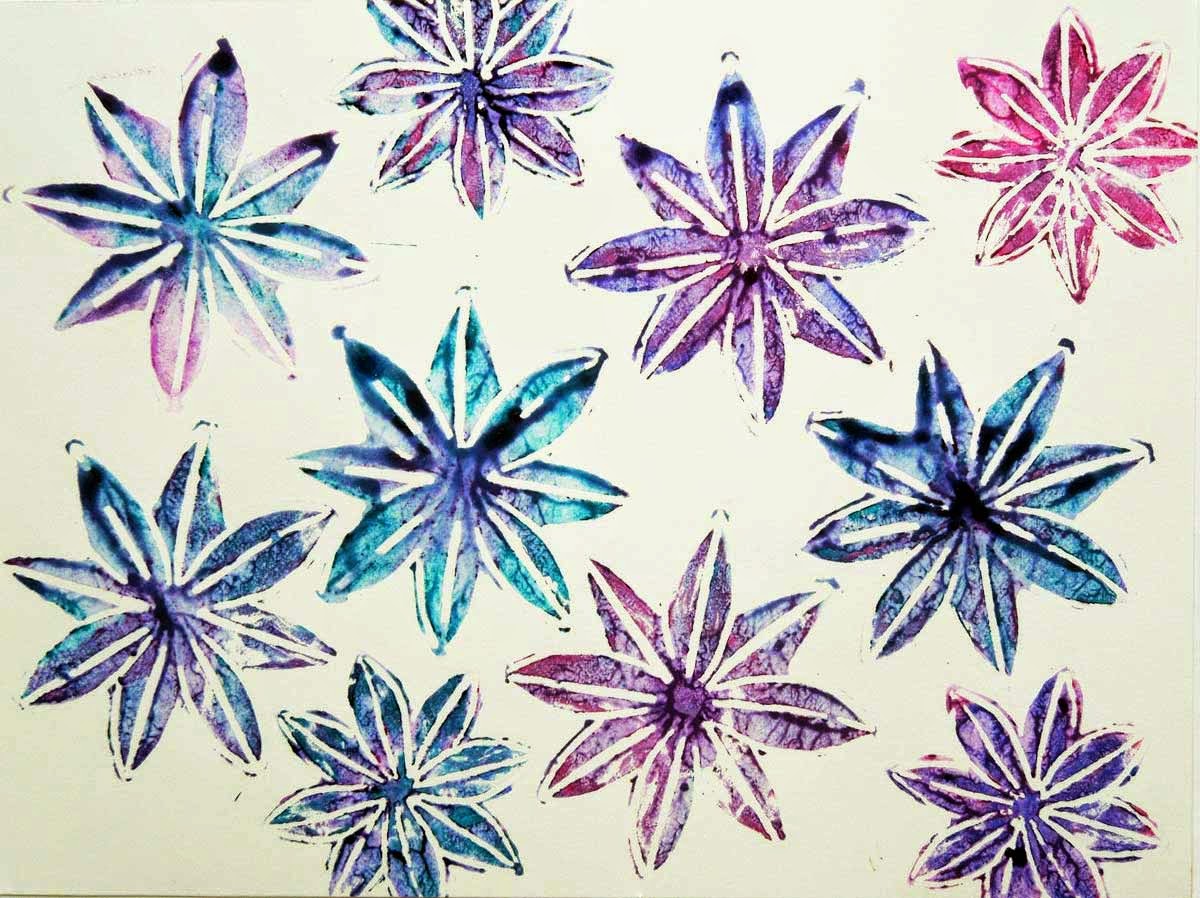
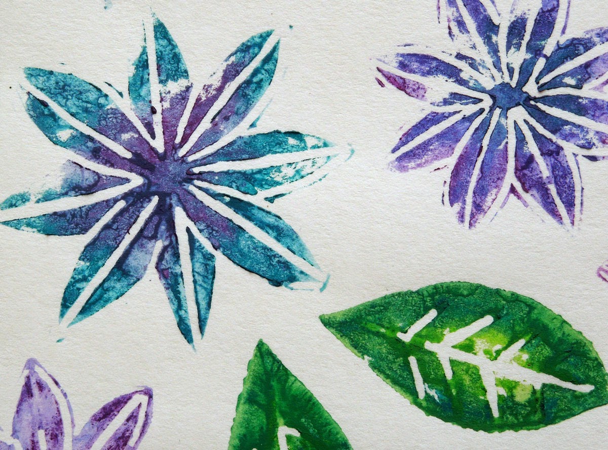
Take a look at the results of my experiments below. The first column shows the pencils applied and burnished. This gives them a bit more metallic sheen, but not much. The second column shows how the pencils dissolve when water is added (dark wash). The third column shows the amount of pigment picked up by the brush in the second column (light wash).


UPDATE: 26 July 2014>>>>> Having obtained some black paper today, I've had a chance to test these pencils on a dark background as well. I must say, they perform much better and look more metallic, especially the traditional set. However, they lose most of their shine and strength when water is applied, so I would recommend using them dry. I've added a photo showing the Derwent metallic pencils on a dark background below. They would be really good for drawing peacock feathers! So, I'm glad to report that I haven't wasted my money after all.


Tuesday 22 July 2014

Black and white doodle cards

I had a few sheets of watercolour paper lying around that I had sprayed with Dylusions inks a few weeks ago for testing.  I wasn't sure what to do with them, until inspiration hit me this morning. I cut them into small cards, slightly larger than ATC size, and stamped some flower images on them in black archival ink. I used Rangers Jet Black ink pad, but there are lots of other similar products that would be just as good. I outlined the stamped images with a white Uniball gel pen and added some text and borders as well. You can use letter stamps instead of hand lettering if you prefer. I like how the black and white designs stand out against the coloured background. These cards are super easy to make and I find doodling very calming and therapeutic.

A word of caution about the Dylusions inks though: you may find that some of them fade rather quickly when exposed to sunlight. I left a sheet of paper originally sprayed bright pink in the conservatory about 4 weeks ago and it has gone completely pale! Therefore, be careful not to use these inks on projects exposed to bright sunlight - it would be a shame to see your hard work disappear in front of your eyes within just a few weeks. They should be safe inside your journals though, I assume.


Monday 21 July 2014

Orange flower on blue background (and a lesson in Creative Freedom!)

This orange and blue design was never meant to be a piece of art, especially not one to share on the internet. I was just fooling around with my gelli plate one day, trying to print with die-cut shapes on rough, handmade watercolour paper. I wanted to see how the acrylic paint would transfer onto the rough surface. I used the ugliest brown paint I had, just so I wouldn't waste my "pretty" colours. The results were uninspiring and I tossed the piece of  paper on the scrapheap. I only just found it the other day and I started wondering what this paper would look like with my Winsor & Newton watercolours.

So I sat out in the garden and just started painting over the unsightly brown print without giving it much thought. There wasn't any pressure to create anything spectacular - after all, this was just a piece of scrap paper and I was only experimenting. There was nothing to risk, nothing to ruin. It is amazing how much creative freedom this belief gave me. I have two expensive journals (a Moleskine and a Strathmore) that I'm too afraid to use in case I ruin them.  But when I work with "scrap" all my inhibitions disappear and I feel so liberated. For that reason, I decided that I will be working on single sheets for a while, until I gain more artistic confidence to start a journal.

In this particular piece I'm sharing with you, I used cadmium red and cadmium yellow for the flower, which coordinated with the brown print already on the paper, and ultramarine blue tinged with viridian green and burnt sienna. I chose burnt sienna because the brown acrylics from the earlier print already "contaminated" my background and I thought another brownish colour would counterbalance it. To my surprise, it came out looking really good, sort of rusty in places, and so burnt sienna has become my new best friend!

I completed the layout with white outlines and doodling on the flower and white dots for a border. I also used Ranger Liquid Pearls for some dotted accents. I really like this design because it will always remind me that I can have as much creative freedom as I allow myself. Instead of trying to create a stunning page in my journal, I will just experiment with scrap pieces of paper (or fabric, or whatever medium) and have fun along the way.

I used a piece of Khadi handmade paper

I accented the outlines of the brown print with a white gel pen

I used a white gel pen for doodling and liquid pearls for accents

I love how the burnt sienna randomly mixed with the blue gave the background a rusty look.


Sunday 20 July 2014

Painted stones decorated with pearls

I've seen a lot of painted stones on the Internet lately and I just had to try this simple but beautiful technique for myself.  I say simple, because you can make it as simple as you like, but I've also seen very complicated projects, like this mandala technique, which I'm sure takes a lot of practice to master.

First of all, you need to find some nice smooth stones. You probably won't find these in your garden, but beaches and river banks are good sources. You can also buy them, but it's much more fun finding your own. I remembered I had a whole bag stashed away somewhere at the bottom of my kitchen cupboard that we brought back from Cornwall years ago. They were just perfect. They can be as large or as small as you want, the main thing is that they have to have a very smooth surface to paint on.

I gave mine a couple of coats of acrylic paint. I used Reeves Acrylics Phthalo Blue, but you can use any other good quality acrylic craft paint for this.  Don't waste your best artist grade paints though!  Two coats provided a really good coverage. (Tip: Paint one side at a time and let it dry before painting the other side.)

I originally wanted to use white paint on dark blue background, but I wasn't sure about my abilities to create something crisp and appealing, so I cheated!  I used some flat back faux pearls instead, similar to these, though mine were self-adhesive. For the ladybird I also used Ranger Liquid Pearls White Opal.

Painted stones can be very impressive and a lot easier to make than I originally thought. Larger stones are great for the garden, just make sure you use weather proof paint and decoration. You can use the smaller stones to decorate flower pots or display them in a bowl. I'm not sure what I'm going to do with mine yet. I think I''ll enjoy them for a while and then perhaps paint over them in the future, possibly to create something a bit more funky.


Friday 18 July 2014

Watercolour Rainbow Inchies

If you've never tried making inchies before, you absolutely must! They're so much fun and easy to make. Inchies are basically 1" X 1" squares that you decorate and display in clusters, which makes them look really good, even if individually they may not be so impressive. They can be made from paper, cardboard, textile, leather, wood, even mini canvases, anything really. And they don't need to be strictly 1" X 1" - they can be bigger (or smaller) as long as they are square shaped.

I was browsing the Internet looking for ideas to make my own inchies and I bumped into this image of rainbow inchies, which totally inspired me and I instantly knew that I had to try this.

I used a sheet of 300gsm smooth watercolour paper, my trusted Winsor & Newton watercolours, and the indespensible Uniball UM-153 white gel pen. I started by cutting the watercolour paper into 1" strips. This is very quick and easy if you use an A4 paper trimmer.

Next, I painted six strips with colours of the rainbow: red, orange, yellow, green, blue and violet and I cut them into 1-inch squares once dry. At this point, I decided that I was going to decorate my inchies with just the white pen, so I needed to make the colours deeper and stronger so that the pen marks would stand out against the background.  I applied another two coats of watercolours, making a darker border on each square.  When they were completely dry, I started doodling on the inchies with the white pen. I was bit lazy and I used the same six designs for each colour strip, but you can come up with individual designs for all of the squares if you want.

Here are my results.  The first photo shows the inchies before I added the doodling. I'm very happy with how they turned out in the end.  This is a fun and rewarding project to try. You literally can't go wrong with it - the inchies will always look stunning when presented in a group. I'm sure I will be making some more in the future using different designs and media.

Watercolur background for the rainbow inchies

Rainbow inchies complete with doodling using a white gel pen


Sunday 13 July 2014

Using your water-based markers as watercolour paints

Did you know you could use any water-based marker pen as watercolour paint?  I didn't know until just this morning! Although, if you think about it, it makes sense as the ink in these pens is watersoluble.

The best way to try this technique is to apply your markers onto a plastic surface. A simple plastic paint palette works fine. Then just add water with a brush and use the pigments like ordinary watercolours.

Water-based markers used as watercolour paints
  This technique is great if you want to match the shade of your lettering to your background, for example, or just to get extra mileage out of  your unloved marker pens. I've got two sets of metallic markers that I rarely use. I've tried both sets and got pretty good results. The pens I've tried for this technique are Crayola Metallic Markers and Papermania Fluid Metallic Brush Markers, but I'm sure it would work with any other water-based pens.

Go on, try this method and breathe new life into those forgotten marker pens at the bottom of your craft drawer! They deserve a second chance!

Watercolour sketch using water-based markers
Diluted with water, these markers behave very much like watercolour paints


Saturday 12 July 2014

Stamping with Derwent Inktense Blocks

Derwent Inktense blocks are hugely versatile. Apart from their usual applications, you can also use them to ink your stamps. I've found they don't work very well with my regular rubber stamps as they are too detailed, but they work great with my home-made lino stamps and foam stamps.

All you need to try this technique are some lino-cut or foam stamps, a mini mister and a few sticks of Derwent Inktense blocks in coordinating colours. Lightly mist the surface of the stamps with clean water, then apply 2 or 3 different Inktense blocks on the wet surface, mingling the colours without mixing them completely. The trick is to know when to stamp - if the surface is too wet, the design might bleed, and if it's too dry, it will not transfer properly. I usually wait until the stamps look just a bit "sticky" but not yet completely dry. If the water is still moving around on the surface, it is too wet.  Wait a few more seconds for it to dry a little and press firmly in place.  I like to keep it pressed down for a few seconds, especially when using on textile to give enough time for the material to soak up the ink.

Below are the results of my experiments stamping with Inktense blocks. First up are my lino-cut stamps on paper and textile.

Lino-cut stamps on paper

Lino-cut stamps on paper close-up

Lino-cut stamps on textile

Next, here are the images of one of my home-made foam stamps used with the Inktense blocks.

Foam stamps on paper

Foam stamps on paper close-up

Foam stamps on textile

Two quite different looks, I think.  I like the watercolour look that the lino-cut stamps created on paper. I find using them on textile less impressive though.  However, the Inktense used with the foam stamps transferred very well onto both paper and textile surfaces giving more crisp results. I will definitely be using this technique in my mixed media and art journaling projects in the future.

What do you think?  Which look do you prefer?  Have you tried using Inktense blocks this way? Please let me know in the comments below.

Thursday 10 July 2014

Lino cutting -my first attempt at stamp making!

How would you like to be able to make your own stamps? Well, you can! They will not be as detailed as the expensive shop-bought stamps, but you can achieve some pretty good effects buy cutting your own designs out of linoleum. All you need is a simple lino cutting tool set and some linoleum sheets to work with. (reviews coming up!)

The first step is to draw your design on the lino sheet. I just used a ball point pen for this. I started with something very simple: concentric and swirly circles.

Next, carefully follow your lines with one of the U-shaped blades. Keep in mind that what you cut away will be the uninked part of the design.

Be careful to always cut AWAY from your body and fingers! Don't press too hard - the cutting should be easy and smooth. You can always go over the grooves more than once to deepen them.

Some people like to carve out the background on the edge of the design, but I think it's easier to just cut around the shapes with a pair of old scissors.  Here are a few stamps that I made using this technique.


They work best with dye-based inks, I think, but you can also try pigment inks and even acrylic paint.  I've tried them with inktense blocks as well. You can find a related post here.

I'm very pleased with the results. You can use this technique to make borders, backgrounds, page accents, etc. I like making circle stamps, because they are very versatile. You can use them, for example, as the centre for flowers. Here's a flower layout I made using some of my lino stamps. You may not recognise that these are stamps because I doodled over them, but the flowers, stems and leaves are all stamped images. Creating with tools that you designed yourself is a very rewarding experience. Try it and you'll be amazed at how easy it is!


Wednesday 9 July 2014

Cheap books to help you learn to draw and paint

It is thought that without training and practice, adults are stuck at a 10-year-old's level when it comes to drawing skills. I believe that is true. I used to think that people who can draw were born that way, with some kind of magical talent which allows them to produce beautiful masterpieces and that this skill is unattainable for us mere mortals.

Now I see things very differently. I think anyone can learn to draw at any age without any special talent. It just takes practice. Some of us may have to practice more than others, but anyone can do it. OK, perhaps not all of us will turn out to be the next Picasso, but we can all improve and perfect our drawing skills. I've decided that I was going to teach myself how to draw through books and online videos.

The internet is a good place to start.  Just check out YouTube and you'll be be amazed at how many people are willing to share their knowledge with you for free. In addition, it's a good idea to invest in a couple of books that teach you the basics. Last weekend, I walked into my local Works and quite impulsively picked up three books on the subject for just £2.99 each. I think they are really good books - I find them very useful.


The first book, Drawing Made Easy by Barrington Barber, is a general guide on drawing and includes tips on how to draw figures, faces, buildings, indoor scenes and simple objects.  It explains about perspectives, ratios and shading. 127 pages of really useful information.

The second book, Drawing Flowers by Jill Winch (also 127 pages), is a more specialised book, which specifically teaches you how to draw different types of flowers. An indispensable skill for us art journallers! The step-by-step instructions include drawing tulips, sunflowers, roses, irises amongst others, as well as leaves and berries.

The third book (my favourite) Painting in Watercolour by Wendy Jelbert and Ian Sidaway is an introduction to the art of watercolour painting. It shows you different tools and methods with a little colour theory thrown in along the way.  It's a good place to start and covers all the major techniques, including line and wash and using water-soluble pencils. This book is 95 pages long.

If you can't find these books in your local Works, you can buy them online. I think they are great value and you get free shipping for orders above £20. You can follow my affiliate links below or visit The Works website directly if you prefer.

Drawing Made Easy

Drawing Flowers

Painting in Watercolour

Winsor & Newton Cotman Pocket Box 12 Colour Chart

I've seen lots of colour charts on the internet and I thought I'd make one of my own for my Winsor & Newton Cotman Pocket Box watercolours, which contains 12 half pan colours as shown below:


I made a 12 X 12 grid and labelled the rows and columns with the name of each colour.  I first laid down the 12 colours from the paint box as they are (you can see these diagonally, starting with 'Lemon Yellow' and finishing with 'Chinese White'.  Then I started mixing them, trying to use equal amounts of each colour. This was a good exercise to familiarize myself with the name of the colours and learn how they interact with each other.  There were a few surprises along the way! Here's my completed colour chart:


My favourite combinations are probably Viridian and Lemon Yellow, making a very bright light green; and Intense Blue mixed with Alizarin Crimson, which produces a pretty purple. I also like how mixing any of the colours with Chinese White returns a light pastel shade, and adding Burnt Sienna or Burnt Umber results in intense deep shades.  This was an eye opener for me, as I thought mixing brown with anything will just make mud, but just look at Viridian mixed with Burnt Sienna or Intense Blue mixed with Burnt Umber. Wow!

I have to mention here though that the colours displayed on the monitor are quite a bit more vivid than they are in real life, and depending on your monitor settings may display differently.

Making a similar colour chart with your own paints will help you understand how different colours mix with each other. This is only the tip of the iceberg!  Imagine the shades you can achieve by varying the ratio of each colour you mix - or mixing three/four colours in varying amounts.  The possible combinations are truly infinite.

One of these days, I'll try the same exercise with my 45-pan Winsor and Newton Studio Set. I just need to find a big enough sheet of paper first!

Friday 4 July 2014

Winsor & Newton Cotman Watercolours

I used to love acrylics, but quite recently I fell in love with watercolours.  I just love their translucency and vibrancy. They are so easy to mix and blend, never knowing what you get in the end. They have a mind of their own, the way they mingle on the paper.  You can control them to some extent but the end result is always a bit of a mystery. I like that unpredictability. I'm always pleasantly surprised at what they can achieve. Watercolours are also a very forgiving medium: if you don't like the results, you can always change it by adding more water or colours and mop up any accidents with a dry paper towel.

A few weeks ago I bought a Winsor & Newton Cotman Watercolours Pocket Box. I absolutely love it! It contains 12 half pan watercolour paints and a small brush, which seems to be very good quality. You know how the manufacturers sometimes include inferior accessories with their products as selling points and you think, why even bother? In this case, the brush is as good as the rest of the set and a valuable addition.

The box is very small - it actually fits in your pocket, but it's all you need to start painting with watercolours. You can mix numerous other shades with just these 12 colours and the half pans go a long way. At under £10, I think it's very good value.  Since then I also bought the studio set. It was an absolute steal for just £24.99 on eBay, so it's worth shopping around. Amazon tends to have the best prices, but not always.

If you are after a good quality watercolour set on a budget, I'd highly recommend this one.  Take a look at the colour chart I did using this set.


Mini journals with Dylusions inks

I recently bought a pad of A4 watercolour paper to experiment with.  On the same day I also received my order of Dylusions ink sprays.  It didn't take me long for me to put the two together!  The results were amazing! I loved blending the colours and let them mingle on the watercolour paper. Some of the colours are so vivid, they almost hurt my eyes! I wasn't quite sure what to do with my inked papers though.  In the end I decided to turn them into mini journals. I also cut up a sheet for bookmarks to be decorated later.

When cutting the sheets for my journals, I was careful to make sure that the grain runs parallel to the spine, which seems to be quite important in book binding to ensure it lies flat.  My A4 watercolour paper had the grains run along the long side (in portrait orientation) so I just simply cut the A4 sheets in half to make 2 X A5 sheets and then  folded them in half again to make an A6 journal. I also cut some of the A4 sheets into DL size strips and folded them in half. Here's a better explanation of sizes: A4/A5/A6/A7/DL.

Then I pricked 4-5 holes along the spines and sewed three pages together (using regular sewing thread) to make 6-page mini-journals.  I'm not very good with needles and I didn't follow any sewing pattern - just went up and down the holes until I was sure my pages were held securely together.

I'm not sure what I'm going to do with these journals yet. I'll probably use them for some quotes and doodles.  I'm thinking along the lines of black and white designs, as they already have too much colour on the background. We'll see. At the moment, I just like looking at them the way they are!


Here's a brilliant tutorial on YouTube by Sea Lemon, that explains this journal binding process much better than I have done!


Songbird - an art journal layout inspired by the Eva Cassidy song

This was one of my earliest layouts, but also one of my favourites. I actually had to recreate it as I messed up the first attempt by trying to seal it with hairspray.  A word of advice about hairspray: don't!  Purchase a proper fixative made for this particular purpose instead. Hairspray does not work - or at least it did not work for me. It completely dissolved my archival ink. Just so you know!

Back to my layout: I started out by laying down some gel crayons for the background.  I've found them on eBay - they were very cheap, kiddie-type gel crayons similar to these and I just blended them with my fingers. Be warned though: you won't be able to write on top of gel crayons. If you want to do that, first you have to seal it with a thin layer of fixative (which may or may not work) or clear gesso (which works better, I think).

Next, I layered the images of the bird and music notes that I cut out of a napkin. I used gel medium to stick these down.  When working with napkins, make sure you separate ALL the layers and only use the layer with the image on it, otherwise it will separate as soon as you try to stick it down.  Be extra careful when handling the thin layers as they tear easily, especially when wet.  On the plus side, the white parts will completely disappear, leaving you with just the image and your background design showing through, as they were stamped.

To finish my page, I printed off a quote using a computer font, cut out the individual words and shaded them with gel crayons and highlighted the edges with oil pastels. I also stenciled on some white dots and added some circles and splatters with white gesso as accents.


The quote comes from an Eva Cassidy song.  You can find it on YouTube:


Thursday 3 July 2014

Flower of Life: before and after

This is the first page in my new Strathmore Mixed Media journal.  I didn't know where I was gonna end up when I started out.  I just splashed some green/blue/yellow watercolours on the background.  I was amazed at how well the paper was handling this heavy wash, being only 90 lb in weight as opposed to the usual 140 lb.  It did not curl or buckle.

Next, I cut out a rough outline of the flower using thin white tissue paper, which I stuck down with matte gel medium. I'm not sure if this step was necessary or not, but I did it so as not to affect my watercolour background. I used white gesso to paint the petals and watercolour for the stem and leaves. When it was all dry I added the sketchy outlines and the words inside the leaves and the petals.

The words are meant to reflect the things that are most important in my life, in no particular order. I actually quite like the flower without the added doodles, just as a watercolour painting.  Luckily, I took a photo of my page at that stage, so I can compare the two. Which do you think is better? Perhaps less is more in this case?


Derwent Artbars vs Derwent Inktense Blocks vs Caran D'ache Neocolor II

If you are wondering whether you should get the Derwent Artbars or the Inktense Blocks, it's an easy choice to make between those two.  I would recommend the Inktense all the way!  I used to own the 36 set of Artbars, but recently sold it on eBay.  I was going to use them alongside the Inktense blocks, as the Artbars have a better range of lighter colours, but the deal breaker for me was when I found out that it is hard (almost impossible) to write on top of the Artbars due to their wax content.

Here's a little experiment comparing these two products, along with the Caran D'ache Neocolor II wax crayons:


All three products dilute and blend easily, but the Inktense stands out from the rest.  It's so easy to blend and returns the most vibrant tone of all three.  The Artbar almost pales in comparison and leaves a waxy-looking residue behind. The Neocolor II is quite vibrant too, but it took several washes to make the crayon marks disappear, whereas it only took one swipe with a wet brush to completely dissolve the pigment in the Inktense.

The Inktense also wins as the easiest surface to write on. I had no problems at all writing on top with my Staedtler waterproof fineliners, once it was completely dry. Both the Artbar and the Neocolor II, however, caused problems with the writing, the Neocolor II perhaps less so.  It's probably because they are wax-based and the wax tends to clog the pens.  After writing on the Artbar surface my pen was completely blocked and I had to use hot water to unclog it.  You can see in the photo that the Inktense has the strongest and smoothest pen marks.  Inktense therefore is the overall winner and my favourite choice of medium!

I'm going to use the money raised from the sale of my Artbars to invest in some more Inktense blocks.  I originally bought the 36-piece set and I've already bought a few more colours individually.  Inktense blocks are open stock, which means that you can buy just the colours you need.  I would suggest that you initially invest in a smaller set (24 or 36) as they are cheaper that way and then buy a few more colours individually to complete your collection. The reason I wouldn't buy the full 72 set myself is because there are a lot of earth colours (browns and greys) in the range and as art journallers we really just want the more vibrant, vivid colours, don't we? (pinks, reds, blues, greens, oranges, yellows, etc)  Buying them one by one allows you to pick and choose, although it is unarguably more expensive than buying a set.

I would recommend buying the smaller sets from Amazon, and the individual blocks from Jackson's Art Supplies. They have the full range available priced individually at £1.30 and they offer free p&p above £20.00 for smaller items. Mine were delivered extremely well packed, each block cushioned in a foam holder.  They also carry the Caran D'ache Neocolor II open stock.  I'm thinking of buying a few pastel/skin tones to complement my Inktense collection.

Below are some product links you may find useful. (These are affiliate links to Amazon.)

Derwent Inktense Blocks 36

Caran D'ache Neocolor II 15

Inktense Block Cadmium Orange (example)

Wednesday 2 July 2014

Watercolour cards - my first post!

I bought a couple of journals several weeks ago, but I've been reluctant to use them in fear of ruining them. I think they are too nice to mess up! How sad is that?  I feel I have to work on my skills before I feel confident enough to put that first brush stroke in an actual journal.

So instead, I bought some good quality watercolour paper, which I cut into smaller pieces to experiment with. This way, I didn't need to feel intimidated by the size of the design and if I messed one up (it did happen!), I just moved onto the next card, no harm done. I find this very liberating.  An A4 sheet makes 8 cards. They are slightly bigger than an ATC at around 3X4 inches. I'm thinking I can probably use these as inserts in my future journals.

Let me share the images of some of these cards with you:


I kinda like them. I think they look better on screen than in real life though - somehow the colours are more vibrant, thanks to Photoshop.  For these cards, I first drew a rough outline with a pencil and then painted them with watercolours, letting the colours blend. I waited for this to dry before painting the background. At this point, it's not much to look at, but as soon as you add the black and white sketchy pen outlines, the designs pop.

I also painted the back of the cards with a strong watercolour wash and just let the colours mingle.  Here's a peek at some of them:


I am quite happy with the results. I'm sure I will be making some more of these. They would also make great bookmarks.

Here's a list of products used in this project:

Daler Rowney Aquafine aquarelle artists watercolour SMOOTH pad A4 hot pressed

Winsor & Newton - Cotman Water Colour 12 Half Pan Sketchers' Pocket Box

Staedtler pigment liner fineliner technical drawing pen set of 6 assorted line widths

Uniball Signo UM153 White Gel Pen