Wednesday, 21 October 2015

WOYWW #333: Altered journal cover II

I wasn't sure whether I was able to link up to this week's WOYWW, but I thought I can't possibly miss #333, so here I am! I managed to take a photo of my desk last night while working on a LifeBook page yet again. What can I say? Collaging and paper piecing always creates a big mess, as you can see:


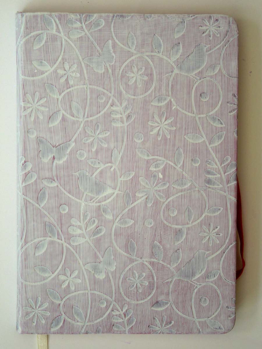
Since I can't show you the finished page yet, I'm going to share with you another project I completed earlier, which is (yet another!) altered journal cover. This project came along out of curiosity when I bumped into a bottle of  DecoArt "antiquing cream" in Hobby Craft and had no idea how to use it. Intrigued, I bought it, thinking I'd do some research to find out more about it. This is what I found on YT, which also led me to discover Andy Skinner, Britain's answer to Tim Holtz!


Here's my project using a similar technique on an embossed journal. I first gessoed the cover, then applied black antiquing cream, followed by red iron oxide fluid acrylic by Golden. I also used some bronze gilding wax as a finishing touch, which works great on embossed surfaces. My journal cover is now completely transformed and almost unrecognizable!


Thanks for visiting today! If you would like to snoop around other crafty desks, just visit the Stamping Ground. You can also take part - just create a link to your blog post each Wednesday. Check out the rules here

Tuesday, 20 October 2015

LifeBook Week 43: Celebrate Life

This was a fun LifeBook lesson with Patti Ballard about celebrating little things in your life every day.

I changed a few things to make the project my own. I used gelli prints for some of the elements in the composition instead of patterned paper on the background. Because of this, I tried to keep the background fairly neutral, so the gelli prints wouldn't be overwhelmed by too much texture. I added the little bow as an afterthought, and I think it works well.

This page came together quite easily and it was a great opportunity to use some of my gelli prints. I'm really grateful to have some easier/quicker lessons, because they give me a chance to catch up with previous assignments that I missed earlier this year. I'm right on track!


Monday, 19 October 2015

LifeBook Catch-Up Week 22: Reflections of You

Week 22 of Lifebook titled 'Reflections of You' was taught by Jeanne Oliver.When I first watched the videos for this lesson, I felt a bit intimidated and I wasn't sure if I could do it. In the end, I didn't follow the instructions closely and did a lot of it my way (the only way I know how!), but I kept a few cool ideas from the lesson, namely:

  • using my own photo as the basis for the portrait
  • applying collage pieces from magazines for the hair and clothes
  • adding book paper to the face
  • adopting a muted palette
Overall, I'm quite happy how my painting turned out, though I know there's still a hundred and one things that could be improved. I definitely feel that my skills are improving though, which is good! Although my portrait looks nothing like me, I'm still there somewhere underneath all that paint!

Instead of the additional image transfers according to the lesson, I added a quote, because my composition worked better this way. Plus, my blogging friend, Lynne, challenged me to use this quote on a journal page, and this was a good opportunity to do so! 

Here's my completed page and I'll also show you the original sketch over my photo. It doesn't look anything like me!


Friday, 16 October 2015

LifeBook Week 42: Playing with art supplies

This week's bonus lesson in LifeBook came from the lovely Alisa Burke. Although there was no project to complete, we did get a challenge to use our existing art supplies in new ways to maximize their potential. This was challenge was right up my street! When I first became interested in art, over a year ago now, I did nothing but experiment! I seriously wondered whether I would actually make any art rather than just play with my supplies. I still buy things out of curiosity rather than necessity, just so I can play with them.

The other day I saw a review about the Cretacolor Aquastics, which are water-soluble oil pastels. I just had to have them even though I already have the Neocolor II's, the Inktense blocks, the Gelatos and the Portfolios, along with a few other cheaper brands of similar products. But they are all slightly different from each other - with different properties and colours. This lesson came just at the right time for me to experiment with my new oil pastels.


I took a sheet of watercolour paper and started to explore the different ways I can use these crayons. Here's a list of methods I could think of along with my observations:
  • use them dry (they are rather soft and glide well on the paper)
  • use a wet brush to activate their water-soluble  properties on the paper (they are not as easy to activate as Neocolor II's, but easier than Portfolios or other water-soluble oil pastels I have.)
  • dip the tip of the pastels into water and draw with them (they are darker and more vibrant this way)
  • take the colour straight from the tip of the pastels with a wet brush (again, they're not as readily soluble as neocolor II's, I don't think I'll be using this technique much)
  • smudge them with dry fingers (they're not at all smudgable!) 
  • smudge them with wet fingers or with gesso (this works much better)
  • mix them with gesso (this produces some nice muted, pastel tones)
  • spray water on a rubber stamp and use the pigments from the pastels for stamping (this works quite well!)
  • lay down the pastels dry and use a stencil to activate them with water (pretty cool effect!)
  • activate a layer of pastels with water then use a stencil to remove the colour with a paper towel. (also pretty cool!) 
  • draw over a stencil and activate with water while the stencil is still in place (nice!)
  • use two or more co-ordinting colours dry and blend them with water or gesso to make different shades of colours (nice blends!)
  • heat them with a heat gun (they don't really melt, which means, there's probably not much oil in them)
  • use them for outlining dry or wet (this is probably what I will do most of the time, as they are quite thin, so I can draw thinner lines with them)
I'm sure there's lots of other ways to use them, but this is as far as I got. I'll share my scribble/test page with you, which I then turned into a proper journal page not wanting to waste the precious watercolour paper. I used the cool technique of layering I learned in week 39 from Roben-Marie Smith, which has now become my go-to method of turning anything on paper into a journal page!

I only used scraps of collage papers and some pieces of fabric lying around on my desk to make a collage, which I then, gessoed, painted and stencilled over. The elephant stencil is from Clarity Stamps. The author of the quote is unknown.  This page was not part of the lesson, but I really didn't want to waste that paper! If you know of any other ways of using these oil pastels, let me know in the comments below!

Sorry about the amount of photos to follow, but I really love the colours and textures in this page and I just couldn't stop myself! Hope you have a fast internet connection and you get as much joy out of them as I do!

My oil pastels test sheet

scrap collage pieces added

paint and stencils added

finished page complete with elephant, flowers, quote and doodles


Thursday, 15 October 2015

LifeBook Catch-Up Week 32: You Are Worthy

As I was browsing the past lessons that I missed during my absence, I came across Tam's offering during week 32 of LifeBook. It is not so much the page, but the sentiment behind it that really spoke to me. The lesson comes with a healing exercise, where we work through our limiting beliefs, transforming them into liberating beliefs.

I've found this exercise extremely powerful, because often we are our own worst enemies when it comes to finding happiness. By identifying and understanding our limiting beliefs, we are able to change our attitudes and attract positive changes in our lives. My biggest limitation is the belief that I don't have the right to be happy while I see other people struggle and suffer. It's almost like I feel guilty for being happy, while other people are not, so I make myself feel unhappy on purpose. How silly is that?

Once I realized that  falling into depression and punishing myself out of empathy for other people does not serve any purpose, I gave myself the freedom to let these beliefs go (to fly above them, as the page depicts) and allow myself to be happy, because I know I deserve to be happy. As does everybody else! But here's the thing: nobody else can make you happy - only YOU can make you happy. Everybody is responsible for their own happiness. I am not responsible for other people's happiness. This revelation is hugely liberating for me!

I used these sentiments on my page to remind myself that I am worthy and I deserve to be happy. The design is completely Tam's - I just put my own spin on it with some small details. Hope you all can find your own happiness!