This month's challenge in the Kraaft Shaak is to create a project involving colouring. Oooo, who doesn't like colouring, right? There's something about colouring that takes me right back to my childhood and makes me feel all warm and fuzzy inside!
I've created this picture with simple shapes arranged as a 3X3 grid. My first step was to create a stripy border with some black and white washi tape on a piece of watercolor card about 8 X 8 inches in size. Then I marked my grid with a pencil and drew a rough sketch of the shapes. I coloured my shapes and my background with Inktense blocks and watercolour paints. At this point, the picture didn't look much good, but once I added the black and white outlines and doodles, it came alive! I used Uniball Signo gel pens for the outlining.
This project is so simple - anyone can do it! Why don't you have a go creating something similar and post it to the Kraafter's Kommunity marked #KSCFEB15 for a chance to win this month's prize, a canvas bag ready for you to alter with your own colourful designs!
Saturday, 14 February 2015
Thursday, 12 February 2015
LifeBook Week07: My heArt community
Week 07 of LifeBook included two bonus projects. The first one was the Magic Cottage, which I shared earlier and this second one is 'My heArt Community' demonstrated by Jill Berry. I deviated from the lesson by creating a journal page instead of the 3D figures in Jill's lesson, but I used the same sentiment and the same paper tearing/piecing technique as the original lesson.The simple figures represent my sharing communities on the Internet: the two G+ communities I frequently visit (the Kraafters Kommunity and Mixed Media Sharing Community), the Facebook sharing groups I belong to and a blog hopping community called WOYWW. These four communities pretty much keep me occupied full time and I'm so grateful for all the love, inspiration and sharing that takes place in these art circles. I love you guys (and by that I mean girls)!
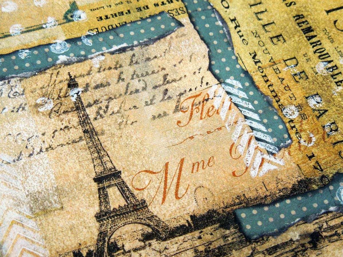
I started my page with a collage of book papers, napkins and pieces of washi tape. I added some Neocolor II water-soluble crayons followed by some white acrylic paint applied with a brayer. I then added some of the colour back using the same three crayons: cobalt blue, malachite green and ocre. The photos below show the development of my background:
![]() |
| Initial collage |
![]() |
| Neocolor II crayons added and activated with water |
![]() |
| White acrylic paint added with a brayer |
![]() |
| More Neocolor II's added |
You can see my final page below, including some close-up photos. It's a simple little page, but came straight from my heArt!
Wednesday, 11 February 2015
WOYWW #297: Week in review and yet another altered tin
Hello again WOYWW deskers! It's Wednesday yet again! Yay! Actually, I'm writing this on Tuesday night, otherwise I wouldn't stand a chance of posting this on Wednesday morning. If you've never heard of the What's On Your Workdesk Wednesday phenomenon, just mosey over to the Stamping Ground to find out all about it.I have two shots of my desk again this week. One staged with all of last week's artwork neatly laid out and another one I took in the middle of a project, showing the naked truth in all its glory. I'll show you the messy one first to get it out of the way. This was taken on Monday night while I was working on a LifeBook assignment.
![]() |
| Messy desk on Monday night |
And here it is again a few hours later on Tuesday morning!
I'll give you links to each of these completed projects on my desk, in case you want to take a closer look:
- Word of Inspiration Wednesday journal page
- Documented Life Project journal page
- LifeBook Week06
- LifeBook Week07
- I made this tin with the same technique as my altered journal cover, using texture paste, scrap die-cut shapes, inks and gilding wax. I'll show you some additional photos below.
![]() |
| First layer of ink - two more to follow |
![]() |
| I had a green thumb for a couple of days - eeks! People must have thought I was turning into an ogre! |
![]() |
| Final look with the gilding wax added |
![]() |
| Shown from a different angle |
![]() |
| I used a stencil with texture paste for the dragonfly |
![]() |
| Same stencil with a butterfly design |
![]() |
| Die-cut shape - a left over piece from cutting stencils on the Cameo |
![]() |
| Another piece of scrap die-cut - textured cardstock works best! |
Tuesday, 10 February 2015
LifeBook Week07: Magic Cottage
This week's LifeBook project features a magic cottage, our sacred place, where we can escape from the world. This cottage can stand for anything we want it to. This was one of two bonus lessons this week, taught by Violette Clark, who also showed us around her quirky home, which she turned into a real-life magic cottage.My dream is to have my own dedicated craft space, which I can decorate to my heart's content with colour and surround myself with art and inspiration. My cottage represents that little corner of the universe I would call my happy place. It's still just a dream, but I hope one day it will become a reality.
For this page, I used acrylic paints for the background, which I spread with a plastic card instead of a brush. I used two shades of blue, a bright green and white to achieve this look:
I used a home-made stencil to make clouds and a dotted texture stamp to break up the background a bit. I glued all my elements on top of this. I drew the top part of the face on a separate piece of watercolour card and used the same shading technique Tam showed us in previous LifeBook lessons. I cut the pieces for the cottage, the arrow and the hearts from gelli prints. The butterflies were cut from a napkin and the words strips were printed on the computer. The words represent what I want my craft space to be like. I used black and white pens to outline everything to separate them from the background and shaded the edges of the page with a purple Gelato to frame it. I also added some purple glitter glue to some of the elements.
Sunday, 8 February 2015
DLP Week06: Don't Stop Me Now
This week's Documented Life Project challenge is layering and the prompt is "Don't stop till you get enough". This immediately reminded me of the famous Queen song so I decided to use the lyrics for my journalling on this page. I first became interested in art journalling about a year ago and this sentiment expresses my feelings towards this wonderful art form perfectly. I do not ever want to stop because I'm having such a good time!I tried to use as many layers as I could without making my page look too messy. I started out with brayering three colours on my blank page using acrylic paints. I decided to keep to a neutral palette this time, which is quite unusual for me. The colours I used were: burnt umber, portrait pink and unbleached titanium. This is what I got with these first three layers:
![]() |
| Layers 1-3: brayering acrylics |
![]() |
| Layers 4-5: napkin and stamping |
![]() |
| Layers 6-7: paper strips and inked edges |
![]() |
| Layers 8-9: journalling strips and white stamping |
Subscribe to:
Posts (Atom)